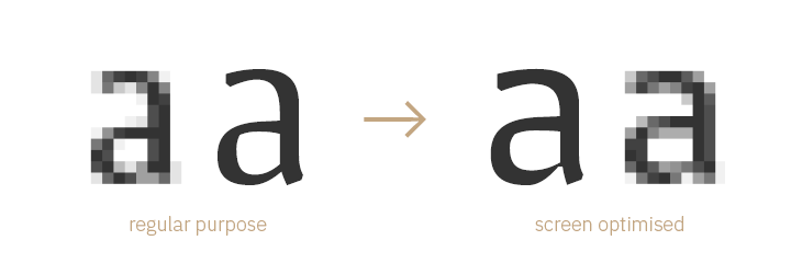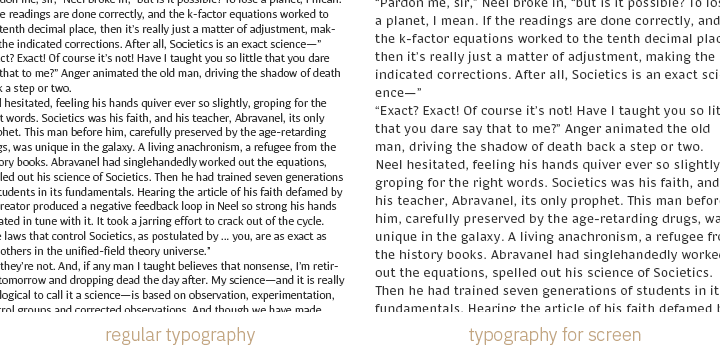

By optimising fonts for screens, designers and developers can ensure that the typefaces are displayed consistently and clearly across different screens and devices. Screen Optimisation can help to improve the readability and legibility of text, and can make it easier for users to read and engage with the content on a website or application. For modern fonts, Screen Optimisation is a must because screens and devices can vary widely in terms of their resolution, size, and other technical characteristics, and these differences can affect the way that typefaces are displayed.
has the expert knowledge needed to create screen optimised fonts to your wishes, either from an existing typeface family or from scratch. If you want to ensure a consistent reading experience – we’ll create fonts that cover all required devices.
Benefit from our Screen Optimisation skills
There are several design features that are typical in a typeface that is optimised for the display on screens:

An increasingly popular strategy manages to combine traditional letterforms with the requirements of Screen Optimisation: Variable Fonts provide a way to store indefinite variants of a typeface in a single font, thus giving the opportunity to (automatically) finetune the font as required by the setting it is being used in, depending on parameters such as the device, the font size, or other quantifyable factors.
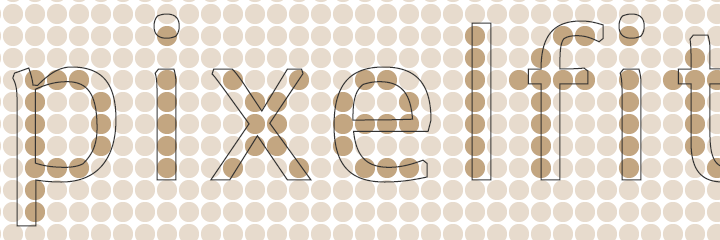
Font hinting is a technique used to improve the display of text on screen displays. It involves adding small instructions to the font file that help the rendering software align the font’s glyphs (individual letters and symbols) with the pixel grid of the display. This can help make text appear sharper and more legible at small sizes, especially on lower-resolution screens.

The prevalent font formats have different implementations of hinting. However, at large, there are two main purposes of font hinting:
Font hinting is quite laborious when done manually. It can however be automated – the quality of the outcome heavily depends on the preparation of the process, hence it varies greatly with the skills of the font engineer. As it is such a vital part of Screen Optimisation, thus of a modern font, it needs to receive great attention in the production process.
In addition to design features, there are several other factors that can affect the legibility and readability of fonts on screens, and that can be considered when using typefaces on screens, e.g. the use of Webfonts on the web.

One important factor is the size of the font. On screens, fonts can be affected by the resolution and pixel density of the display, as well as the viewing distance of the user. To ensure that the font is legible and readable on screens, it may be necessary to adjust the size of the font, or to use font sizes that are larger than in a print typeface.
Another factor to consider is the spacing of the font. On screens, the spacing between letters, words, and lines of text can be affected by the resolution and pixel density of the display, as well as the viewing distance of the user. To ensure that the font is legible and readable on screens, it may be necessary to adjust the spacing of the font, or to use spacing that is wider than in a print typeface.
As a small studio with a network of distinguished experts, combines the best of both worlds: we consult personally and promptly, are able to tackle projects of any size and charge reasonable rates.
Besides typeface design and technical font production, we also offer typographic and technical consulting. During online or on-site workshops, we share our expert knowledge with design colleagues.